Table of Contents
Firm logos are much more than just an image displayed alongside their names. Logos are some of the first ways that a company introduces its business. Therefore, they make a significant impact on people’s perception of their products and services. The importance of logos essentially makes them the face of the company and can be used to recognise their products and to form a first impression even without one seeing their name. The same case applies to software providers used to develop games for online casinos. In this article, you will know about The Most Unusual Logos of Top Casino Software Providers.
The top names in this sector identify the importance of creating a solid foundation using their logos with potential clients. Some software providers use unusual designs that make them stand out from most. We have prepared a list of the most unusual logos of top casino software providers. Keep reading.
Aristocrat
Aristocrat is among the biggest of slot developers for both the offline and online gambling markets, coming second only to the IGT. The software provider has been thriving for decades, and this feature is partly contributed to its logo. Rather than use an image, Aristocrat slot machines provider opts to use the company name, but with ingenious works into the font. The centre letters T, O, and C feature a design that stands out from the rest with the T cutting through the giant O while the C holds up a bar and the dot. The logo is a symbol of the software provider’s ability to cut through online casino games’ development lines and meet a varying number of needs. The logo also uses the colour blue, which is the most used in the corporate world. The shade invokes a feeling of confidence in the developer’s pokies and loyalty to the brand.
Yggdrasil Gaming
Yggdrasil Gaming sources its name from the myth of the Yggdrasil tree, featured in Norse mythology. Therefore, it is no surprise that the software developer would use the same tale to source its logo, which is the mythical tree. Legend says that the Yggdrasil is the World Tree, and it sits in the middle of Asgard, the land of deities. The tree connects all the nine realms, including Jotunheim (land of the giants), Midgard (land of the humans), and Alfheim (land of the light elves).
Yggdrasil Gaming adopts the concept of connecting more than one element in game development like this mythical tree connects the world. That way, clients can trust to find something to suit their needs in their list of games and services.
Booongo
Booongo has been around for half a decade and was launched to exploit the boom in the mobile gambling rise. The software developer has cemented a solid reputation for itself in the business by not only making its games accessible in nearly every mobile operating system but also having a unique logo. The software provider does use its name as its logo, but with a unique twist.
- The image begins with a stylised lowercase “b” placed in a barely complete circle. It is then proceeded by the name of the game provider spelt out in lowercase as well as it blends from the bright green to turquoise.
- This shade showcases the company as ambitious in its venture and marks its entry into a niche that is a new beginning for the gaming business.
- The first and last “o” in the title are only halfway done, which makes it look like they are encasing the one in the middle.
EGT
Euro Games Technology, otherwise known as EGT, is a Bulgarian casino software developing gem. The software company is a recognisable brand with most online slot lovers, especially those that enjoy modern titles inspired by the classics. EGT has maintained the same logo since it broke into the gambling scene in 2002, which has maintained a sense of familiarity with its loyal clients. The image is that of the game developer’s acronym, EGT, next to a model that can be left to interpretation. From one perspective, the image is a figurine of someone with their arms stretched out above and below the company name. From another angle, it can be something travelling so fast through the gaming space, which represents EGT’s commitment to racing it to the top.
Endorphina
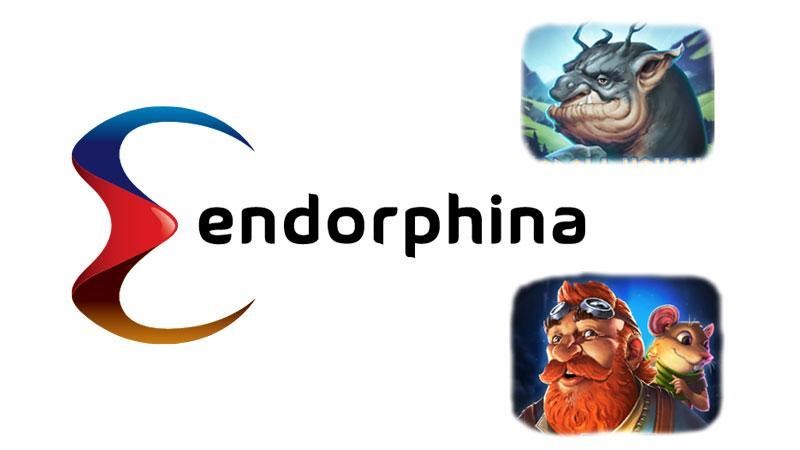
From the company logo, one can tell that Endorphina is a dynamic and versatile company with a foot in both traditional and innovative creations. The software developer uses a uniquely crafted E for its logo, which can be identified from a mile away. The logo uses a blend of three colours – blue, red, and yellow. In colours psychology, each of these shades invokes something different in clients. Blue inspires sincerity and confidence, red shows determination, and yellow brings out merriness and growth. Therefore, the logo gives off the idea that there is something for everyone. It is also used to tell the company’s products without any research since it is mostly used as the spin button in slot machines.
High5Games
High5Games has been a part of the gambling industry since 1995, making it a pioneer in the online niche. The software developer is known for its innovative prowess, notably since it spearheaded social gambling. Even with the sophisticated nature of its products, the gaming company uses a simple logo that still manages to deviate from the norm.
The firm uses its name as its logo, which is spelt out in yellow uppercase letters and the “5” stands taller than all other characters. A small yellow rectangle highlights the H5G that sits in the middle of the name, which also happens to be the company’s acronym.
Microgaming

Microgaming is a powerhouse that hardly needs any introduction. This software company was the first to run online gaming services and paved the way for the industry that exists today. The Microgaming logo is simply the letter M that looks like a careless scribble placed in a circle of blue and green blended shades. This logo is identified with all of the company’s products from its slot games, live casinos, and poker network.
Play’n Go
Most of the corporate world is full of serious approaches to business, but this software provider adds some fun to it. As much as acronyms are common, shortened names are not since they give off a slang vibe rather than a professional one. Play’n Go, however, shortens the “and” in its name, which is an element that sticks with most players. The playful nature of the title makes it serve well as a logo, which is displayed like the “Ready, Set and Go” sign seen in races. Blue, white, and red are the primary colours of the image. The “Play’n” part of the name is spelt on white in a blue strip while “Go” is made red and prominent to prompt players into taking action.
Rabcat Gaming
Rabcat Gaming is another veteran in the gambling industry and has been around since 2001. The slots provider is described as a first-rate, quality company, which is reflected in the logo it uses. The face of the company is a simple image of a cat’s face. The feline is yellow and has two black slits for eyes. Cats are known to invoke a sense of agility, independence, curiosity, and cleverness, all of which Rabcat has showcased over the years.
Parting Shot
The logos of software developers are windows into what one can expect of the presented products. Therefore, it is likely that a firm willing to take a risk with its logo will also offer daring casino games and services that challenge the norm.


